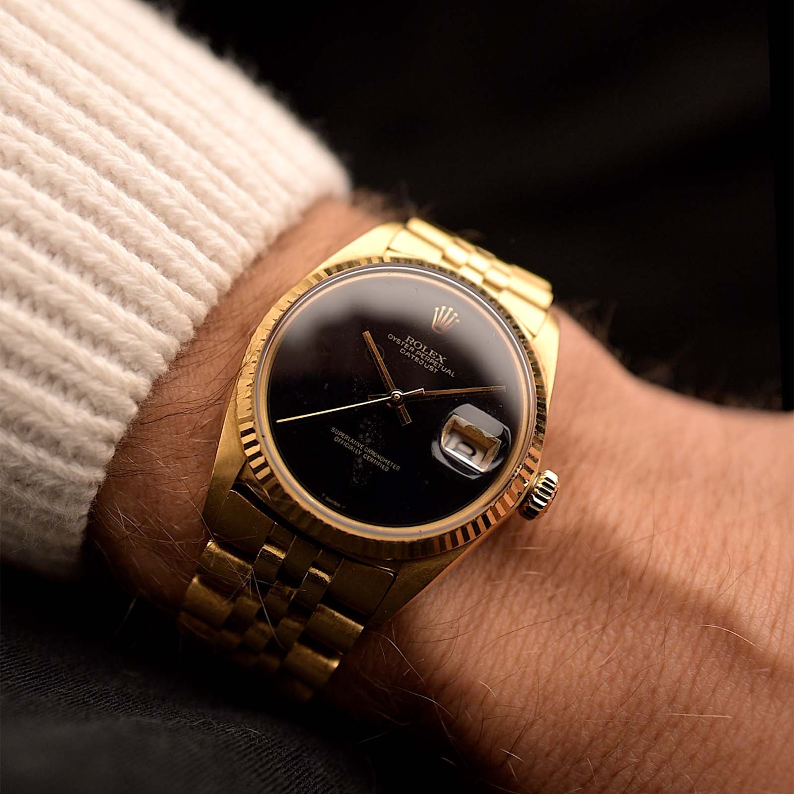
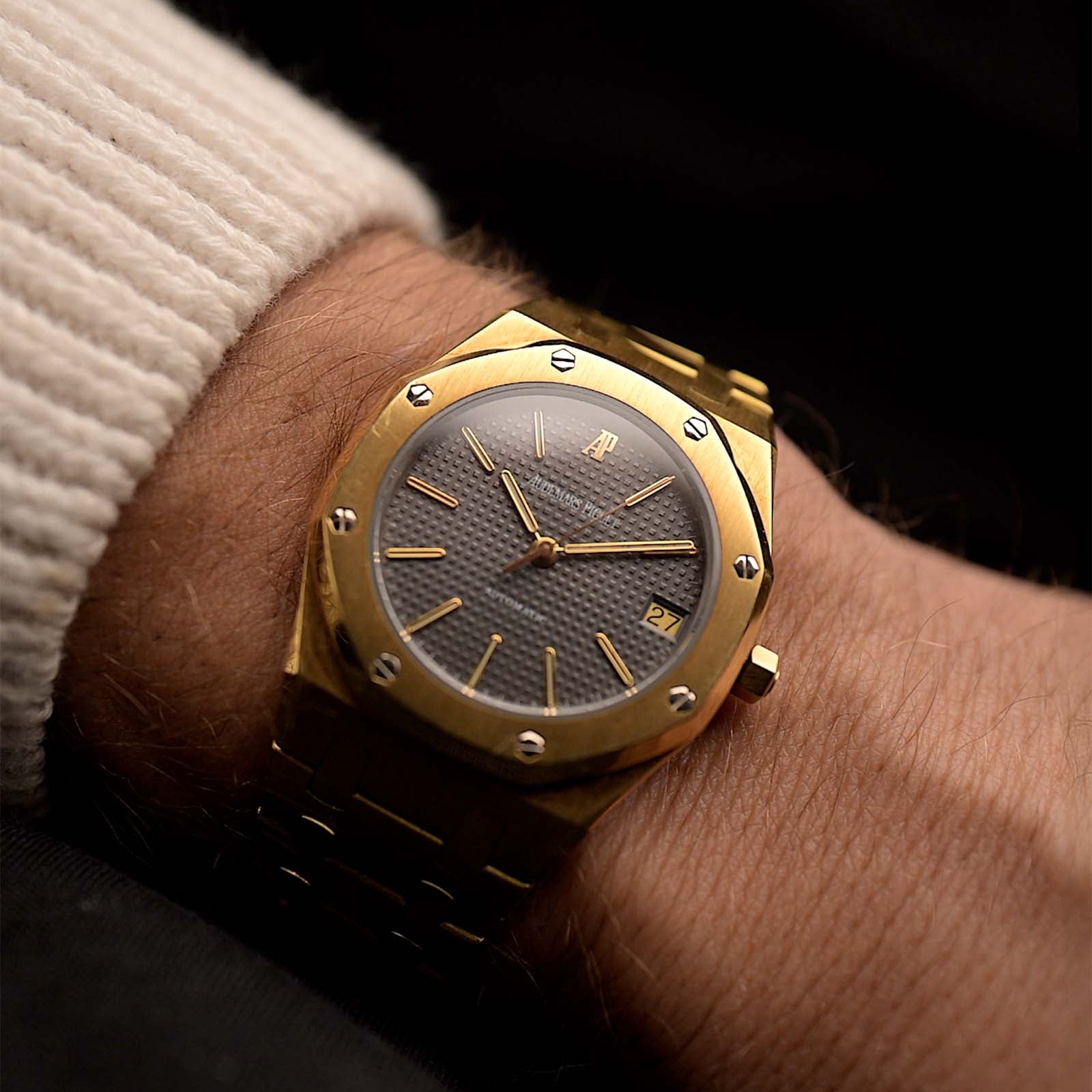
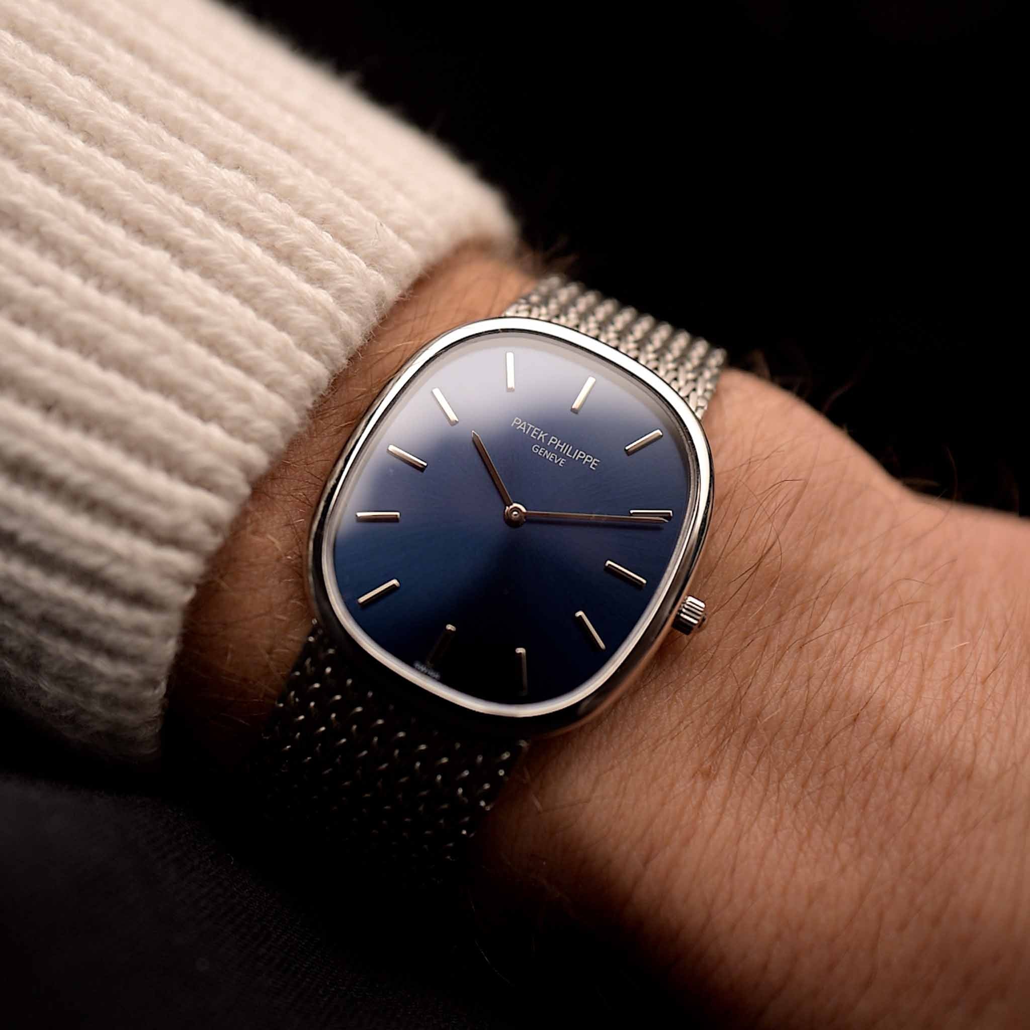
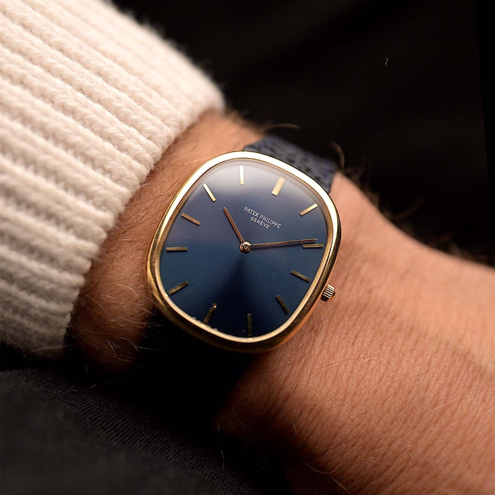
This is III. part of the series about the unique design history of the 1950s watch world. The question we ask this time is whether there has been a defining set of hands, and if that is a feature that can help us to better understand the contemporary design language. So looking at the hot hands of the 1950s it becomes obvious that in a similar way to the popularity of the white dial there is a particular set of hands that is by far the most common in the decade and almost exclusively defines it.
September 14, 2021
Watches of the 1950s - Hot Hands
 Marcus Siems @siemswatches
Collector, Author, Data Analyst
Let’s talk about time. How did the watch world look like back in the post-war era of the Fifties? And I mean not only the timeless icons everybody remembers but the watch market in its entirety. Which design elements were the frontrunners of the time? In this series I want to answer this question with the loupe of quantitative data-analysis and data from over 2500 watches publicly listed on chrono24[1], summarizing the last 80 years of watchmaking.
 The archetypical watch of the 1950s - like this early 1960s Omega Constellation - was a dress watch with a white dial. But what about the hands? Do the hands of this example fit into the Fifties design language as well? Photo @goldammer.me
This is the third part of this series and what we have learned so far is that the 1950s have been a quite unique decade. The numbers teach us about very distinct motifs of watch design and in the 1950s it just had to be a dress watch with a glaring white dial. And this distinct pattern shows with the watch hands as well. In a similar way to the popularity of the white dial there is a particular set of hands that is by far the most common in the decade and almost exclusively defines it.
But let’s have a little experiment first: Without looking, can you describe the design and shape of your watch hands? Without using long-learned specs of course... It’s in plain sight, optically even the most important thing about a watch because it is the design element that actually tracks the passing of time. However, when was the last time you really considered those details? Soaked them in? There are so many beautiful facets to look at and not just the ones from the 1950s.
 Figure 3. Distribution of hand design between 1940 and 1975. Within the 1950s the dauphine hands (and similarly the alpha hands) clearly define the decade. 1940s favorites taper off quickly whereas the index hand is just gaining traction in the Fifties. Examples for the different hand types are given on top - the color corresponds to the trajectories. For another overview of hand designs see also[2,3,4].
So many different designs, from sharp to curvy; from straight to … well curvy again. With lume and without, all different extensions of a rotating wheel to visualize the passing of time. And again the 1950s stick out as an epoch that plays by its own rules. Rarely in history do you see that two particular sets of hands dominate the watch world as they do in that decade.
The so-called Dauphine hands are the hot hand on the 1950s watch face. In the Fifties it is straight out function and geometric perfection when it comes to hand-style. The Dauphine display a straight and sharp form, a deltoid with a triangular cross section splitting the incoming light in half. And you won't see any luminous materials on those blade-like hands. As simple as that: Form follows function[5]. A no-nonsensical fine piece of metal indicating the time, nothing more and nothing less.
The alpha-hands share a very similar trace through time. Not as common as the dauphine overall, yet they visibly peak in popularity in the 1950s. And comparing the shape of those two it makes a lot of sense: The alpha hands are outward shifted Dauphines - slightly more playful than the former yet a natural and literal extension of them.
 The Hot Hands of the 1950s (pun intended) - The Dauphine hands as seen on this 1950s Universal Geneve Polerouter. Photo @goldammer.me
Overall, the 1950s watch hand pattern probably defines the decade best from all of our extracted features. Looking back, most 1940s hands were luminously filled and military associated (i.e. sword & syringe) or showed late-Art Nouveau playfulness (i.e. leaf hands). All of those styles are tapering off in the 1950s. Similarly, going forward in time the Dauphine again declined and had to make room for hands that could again feature luminous materials (i.e. index hands), laying the foundation of modern watch designs.
Until today the Dauphine shape is quite rare in modern timepieces but it has come to a bit of a comeback lately. Several brands are picking up on the mid-20th century flair integrating it into heritage-inspired watch designs. So if you want something that oozes 1950s, get yourself a watch with Dauphine hands. You rarely see something that distinct for a certain epoch.
Taking all the features we talked about by now together, it becomes more and more obvious that the 1950s are an eccentric and distinct period in watchmaking history. It is a decade that shows little variance in itself but couldn't be more different from any other decade of the last century. You can start to see that on the example Fifties watch as well. Quite the looker already, isn't it? Yet a crucial piece is still missing. Final stop: Hour marker.
Check out the the other parts of the series here:
Part I: A Matter of Style
Part II: Dial Color
Part III: Hot Hands
Part IV: Hour Marker
References
[1] Watches from Chrono24, extracted 2020 Nov. 29th; Karlsruhe, Germany;
[2] The Hands of Time – A Guide to Names of the most used Watch Hands; Xavier Markl, Monochrome;
https://monochrome-watches.com/hands-time-guide-names-used-watch-hands/
[3] Know Them Like The Back Of Your Hand: The Most Popular Watch Hands… Explained; Priyam Bagga, Ethos Watches;
https://www.ethoswatches.com/the-watch-guide/watch-hands-explained/
[4] Watches 101: The 12 Most Popular Watch Hands; The Watch Index;
https://www.ethoswatches.com/the-watch-guide/watch-hands-explained/
[5] History of the Patek Philippe Calatrava Part 1 – The Reference 96, The Blueprint; Tom Mulraney, Monochrome;
https://monochrome-watches.com/history-of-the-patek-philippe-calatrava-part-1-reference-96/
All rights on text and graphics reserved to the Author


1 comment
Bravo 👏 so much information i’ve never heard before. Thanks to Goldammer and especially Marcus!
Leave a comment