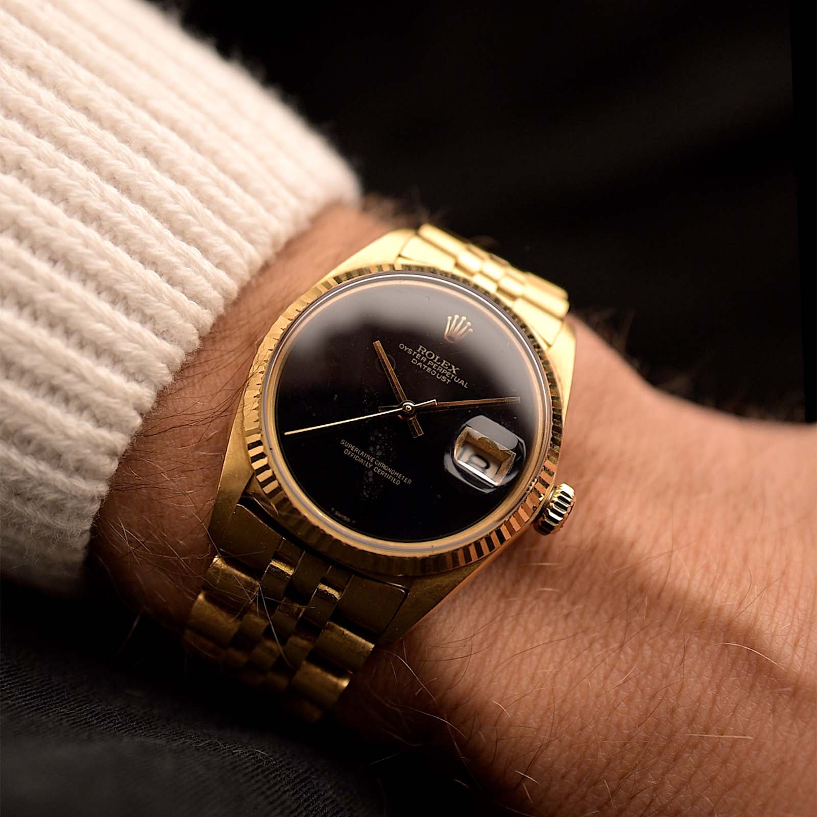
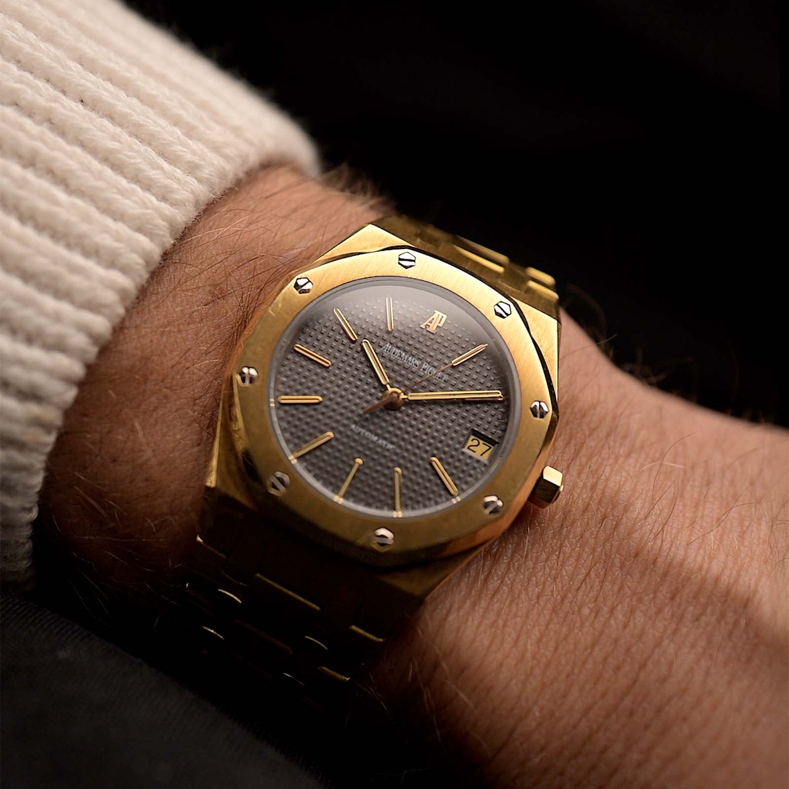
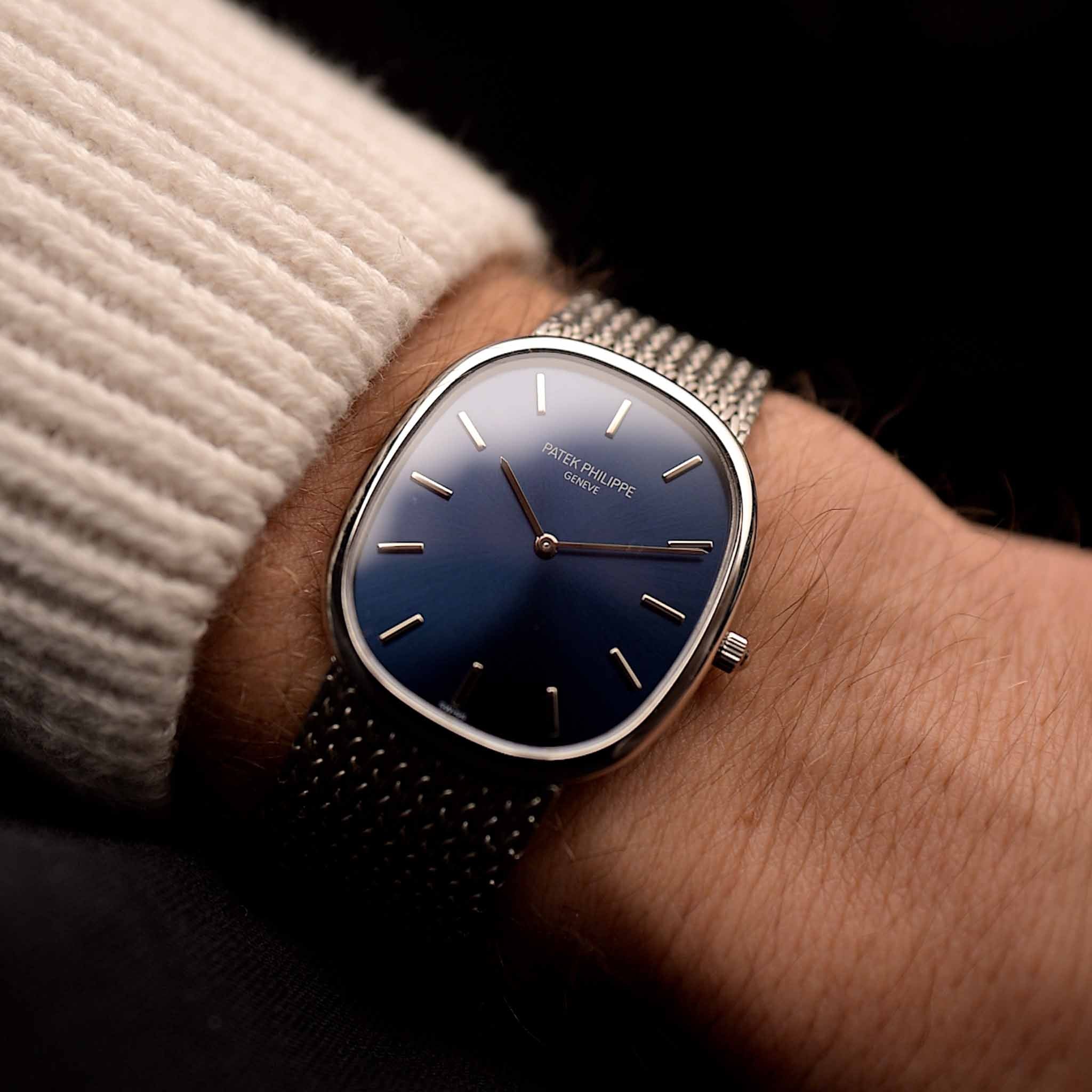
What defines a 1970s dress watch? Is it about lavish materials, impeccable textures or delicate finishing? It appears that during that era the time-telling function of the (dress) watch is only a secondary dimension. The overall design is what matters and shouldn't be distracted by something as profane as time. Never before have we seen so many fancy bezel styles, artisanal bracelets and avantgarde shapes solidified into the foundation of the watchmaking genre of subtle sophistication. It's breaking with convention, a revolution of the classic idea we typically just call - The Dress Watch.
September 13, 2023
Dress Watches of the 1970s - Loud Understatement

Marcus Siems @siemswatches
Collector, Author, Data Analyst
What's a dress watch? Dress watches are the epitomy of elegant design and understatement. They're subtle and let simplistic time-telling shine. Nothing more and nothing less... However, some of these pieces were indeed designed to stick out, to make your wrist bear a complex piece of modern art. And there's one particular era in watchmaking history that brought some of the boldest of them to life - the 1970s.
You wonder how great 1970s dress watches can get? That's how great... bracelet, finish, color, quality, you name it - it's all here.
Never before have we seen so many fancy bezel styles, artisanal bracelets[1-2] and avantgarde shapes solidified into the foundation of the genre of subtle sophistication. But we're getting ahead of ourselves... that might already be part of the conclusion. For now let's run the analysis on 1970s dress watches first. I took over 2000 dress watches listed on Chrono24[3] and tried to visualize the trends that transcend the single watch, that one catalogue listing, and examine what's been popular in the grander scheme of (1970s) events.
1) It's not all gold that blings - Materials
We tend to associate dress watches with gold, but that's not essential. A dress watch can be anything as long as it fits under a cuff and doesn't have too much additional utility to it besides telling the time (and day, date, month, moon-phase, etc.). So material is not a defining factor but rather a design choice.
 Figure 1. Distribution of applied materials in dress watches historically between 1960-2000.
Golden dress watches clearly have been the favorite all throughout the last century yet during the 1970s it's a particularly common choice: 76% of all dress watches during the 1970s come in gold. That's an increase of roughly 20% compared to the 1960s. From the mid 1960s onward we observe a strong trend towards full golden watches. At the same time the demand for steel and also bicolored/gold-plated dress watches decreased.
With the mid-1970s the picture started to change slightly. Not everybody had the financial possibilities to own an 18k gold watch. However, it was hip to own the bling. There's a longing for style, for design, to own something glorious. The audience opened up for loud designs with a strong wrist-presence and interest seems to have been growing by the minute... A new surge for gold-plated and bicolored watches was born (see also the increase during the late 1970s & early 1980s for bicolored pieces).
 Cartier - under new leadership - understood the lust for affordable luxury like no other. The gold-plated (on silver) Tank must de Cartier (1977) and the bicolored Santos Carree (1978) were the result of this new generation of luxury and design loving watch enthusiasts. Photo Goldammer archives.
If you want luxury dress watches but also want them to be affordable you're in a bit of a pickle. Affordable luxury is the very definition of a paradoxon so what can you do? Well, Cartier has been a frontrunner to deliver to this very particular niche evolving during the mid and late 1970s[4-5]. Being known to deliver Haute Joaillerie to the wealthiest and most famous individuals on this planet La Maison started to cater to the elegance-hungry masses.
First, with the Tank "Must de Cartier" in 1977 and one year later with the bicolored Santos Carree[4-5]*. The Must de Cartier line were pieces that featured a less expensive precious metal - silver - as base material to which gold-plating was applied. In a similar fashion the Santos Carree pieces were - for the first time ever in company history - a combination of 18k gold with a non-precious metal (steel). Save to say these moves became instant success.
 Colorful, stylish, elegant, gold-plated - Cartier's way to address the popularity of elegance for the masses. Photo Goldammer archives.
1a) Artisanal gold - Bracelets
With a general increase in gold watches we further observe a particular interest in gold bracelets, too. And not just bracelets, very very cool bracelets that are far from ordinary... But as those fancy options come at a price. Nevertheless, during the late 1970s about every third dress watch (36%) comes on a golden bracelet. Compared to the 1960s with only about 6-15% that's a dramatic uptick in opulence.
 Figure 2. Distribution of dress watch bracelet styles between 1960 - 2000.
During the 1970s jewelry in general becomes quite arvangardistic. Transcending the world of watches abstract yet naturalistic shapes become sought after (do me the favor and google Lapponia[6], you won't be disappointed). And watch bracelets are the perfect playing ground for these types of aesthetic design.
 A small collection of different styles from 1970s dress watches with amazingly complex and simply beautiful bracelets. "I like big clasps and I cannot lie...". Photos Goldammer archives.
2) It's not just shiny, it's colorful, too - Dial Color
We've shed some light onto the body of the 1970s dress watch so far... but it's about time to look the beauty in the eye. And it's not the body but the face that's special for that era as well... some might even call them colorful. Before 1970 the most common dress watches came with a white dial, very clean, very subtle[7]. Common might be a bit of an understatement as virtually every second dress watch had a white dial back then.
 Figure 3. Distribution of Dress Watch dial colors between 1960 - 2000.
Once again the 1970s were the literal golden age for dress watches. Between 1976 and 1982 not white but golden dials dominate the picture (over 40%). Moreover, we find prominent increases in popularity for black (peak 1979, 13%) and the first occurrences of deep blue dress watch dials (1974, 14%)**. On the other side brighter (or cleaner) color choices reached an all-time low in the 1970s and 80s (silver from 23% in 1960s to 5% in 1980s).
Not surprisingly, this is also the time where stone dials become a hot thing[1,10-12]. Staying in the credo of the time: If you're looking for naturalistic shapes and colors as well as opulence you just Have to choose a stone dial! During the late 1960s and early 1970s brands like Rolex and Vacheron Constantin but particularly Piaget spearheaded this new frontier of dial design. And you guessed it, those are colored (and expensive) and rarely silver or white.
 Perfectly incarnating the decade of its inception - a 1970s Audemars Piguet Ellipse with black dial, diamond markers and textured 18k gold bezel and bracelet. Photo Goldammer archives.
3) The complete picture - Hands and Hour Marker
I argue that we could already stop here and you'd have a close to complete picture of the 1970s dress watch. That's how important (imho) the case, bracelet and dial construction are to this era. But since we're at it the next step are the hands and hour markers. And you'll also see how much of a supporting role these key elements play for the rest of the cast.
 Figure 4. Distribution of Dress Watch hand (top) and hour marker styles (bottom) between 1960 - 2000.
Hands and markers are the key elements that tell the time. But as we can see those exact features are the most understated and subtle of all design elements. 54% of all 1970s dress watch hands were baton - the slimmest option of the mall - destined to stay in the background. Similarly, stick hour markers show up (again) on 54% of all 1970s dials (and additional 9% with no markers at all), basically with the same function as the baton hands.
4) What makes a 1970s Dress Watch
In conclusion, during the 1970s the time-telling function of the (dress) watch is only a secondary dimension of the overall design. The lavish materials, impeccable textures and delicate finishing are what matters and you shouldn't be distracted by something as profane as time.
If you got a few minutes Felix will introduce you to three outstanding examples from the "Holy Trinity" that are as 1970s as it can ever get! (Start at 5:52 for the watch erotica)
Let's break this down a bit further. During the 1970s dress watch design truly has been mainly about luscious appearance. These pieces are loud and extravagant and clearly deviate from the classic understatement of the genre. And there's more. There's two distinct branches within this design driven decade.
On the one hand, we got the over-the-top, loud and - in every facet - expensive bracelet dress watches. Those come with stone dials, extremely filigrane finishing all throughout the case and are the figureheads for the era. On the other hand, the style appears to have been fascinating to many and not just the upper 0.1%. Thus, we see a democratization of luxury, too.
 The essence of the 1970s dress watch genre - a lavish white gold Vacheron Constantin with delicately finished case and bracelet as well Lapis Lazuli dial - and a steel and yellow gold Cartier Santos Carree. Photos Goldammer archives.
These two examples are very different in execution but are the condensed essence of 1970s dress watches. This decade shows both ... it's extravagant and attainable, it's precious and just precious-looking, it's for only a handful and for the masses. It's about redefining luxury on every end of the spectrum. But however you look at it, it's about breaking up the classic genre of dress watches, it's a revolution of style above function.
* Further, the use of cheaper Quartz and third-party movements dropped the price for these design pieces considerately.
** Not a coincidence as one of the most iconoclastic 1970s dress watches - the Patek Philippe Golden Ellipse - would show everybody how a splash of color can define the identity of an entire collection[8-9].
References
[1] A History of Vintage Piaget Watches; Tony Traina, Hodinkee;
https://www.hodinkee.com/articles/how-piaget-defined-the-1970s
[2] Jean Pierre Ecoffey; PlusUltra
https://www.plus-ultra.ch/en/tags/jeanpierreecoffey/
[2] Jean Pierre Ecoffey; PlusUltra
https://www.plus-ultra.ch/en/tags/jeanpierreecoffey/
[3] Chrono24, Karlsruhe, Germany;
[4] Inside the Design - Lust for the Must; Liz Stinson, Hodinkee;
https://www.hodinkee.com/articles/lust-for-the-must
[5] Cartier Santos: A Brief History; Tony Traina, Rescapement;
https://www.rescapement.com/blog/cartier-santos-a-brief-history
[6] Lapponia's Story; Kalevala;
https://www.kalevalashop.com/pages/lapponia-story
[7] Dress Watch Design - From 1940 to 1960; Marcus Siems, Goldammer Vintage Watches;
https://goldammer.me/blogs/articles/dress-watch-design-1940-1960
[8] Patek Phillipe Golden Ellipse - the first 18k blue gold dial; Felix Goldammer, Goldammer Vintage Watches;
[9] The Ellipse - Tracing the Origin of Patek Philippe's Design; Marcus Siems, Goldammer Vintage Watches;
https://goldammer.me/blogs/articles/ellipse-origin-audemars-piguet
[10] Hello Stone-Dial Freaks; PlusUltra;
https://www.plus-ultra.ch/en/blog/2023-05-25/hello-stoned-freaks
[11] In-Depth: The History of Stone Dials; Fergus Nash, Time+Tide Watches;
https://timeandtidewatches.com/in-depth-the-history-of-stone-dials/
[12] Stone Dials - All you Need to Know; Felix Goldammer, Goldammer Vintage Watches;
All Rights on the text and graphics reserved to the Author.


Leave a comment