This is the third part of our series on the history of chronograph designs and this time it is all about the question: How can you fit the elusive power to stop the time onto your wrist? One underestimated virtue of watch design is how to case both the dial and the movement in a practical, fitting and literal frame. It is engineering masterwork and should be driven by purpose and not just tradition. That also means that the perfect case - for a chronograph or any type of watch - is not necessarily round.
October 26, 2021
Golden Age of the Chronograph - Case Design
 Marcus Siems @siemswatches
Collector, Author, Data Analyst
This is the third part of our series on the history of chronograph designs and this time it is all about the question: How can you fit the elusive power to stop the time onto your wrist? In my articles I'm analyzing different watch design features with the help of quantitative data analysis. With data of more than 4000 watches, including about 800 chronographs - publicly listed on chrono24[1].
What we have seen so far is that the chronograph design heritage traces back to two very influential epochs within the last 80 years. Epochs that seem to have handed us the principal ancestors of many modern chronograph designs. On the one hand we got the archetypical chronograph from 1950: The watch design seems classic and elegant, the epiphany of chic. On the other end of the spectrum we got the examples from around 1970: Where the chronograph of the time is especially futuristic, edgy and is set to test the limits of what is possible.
 How should the optimal chronograph case look like? Well, depending on the time it's not necessarily round. Photo @goldammer.me
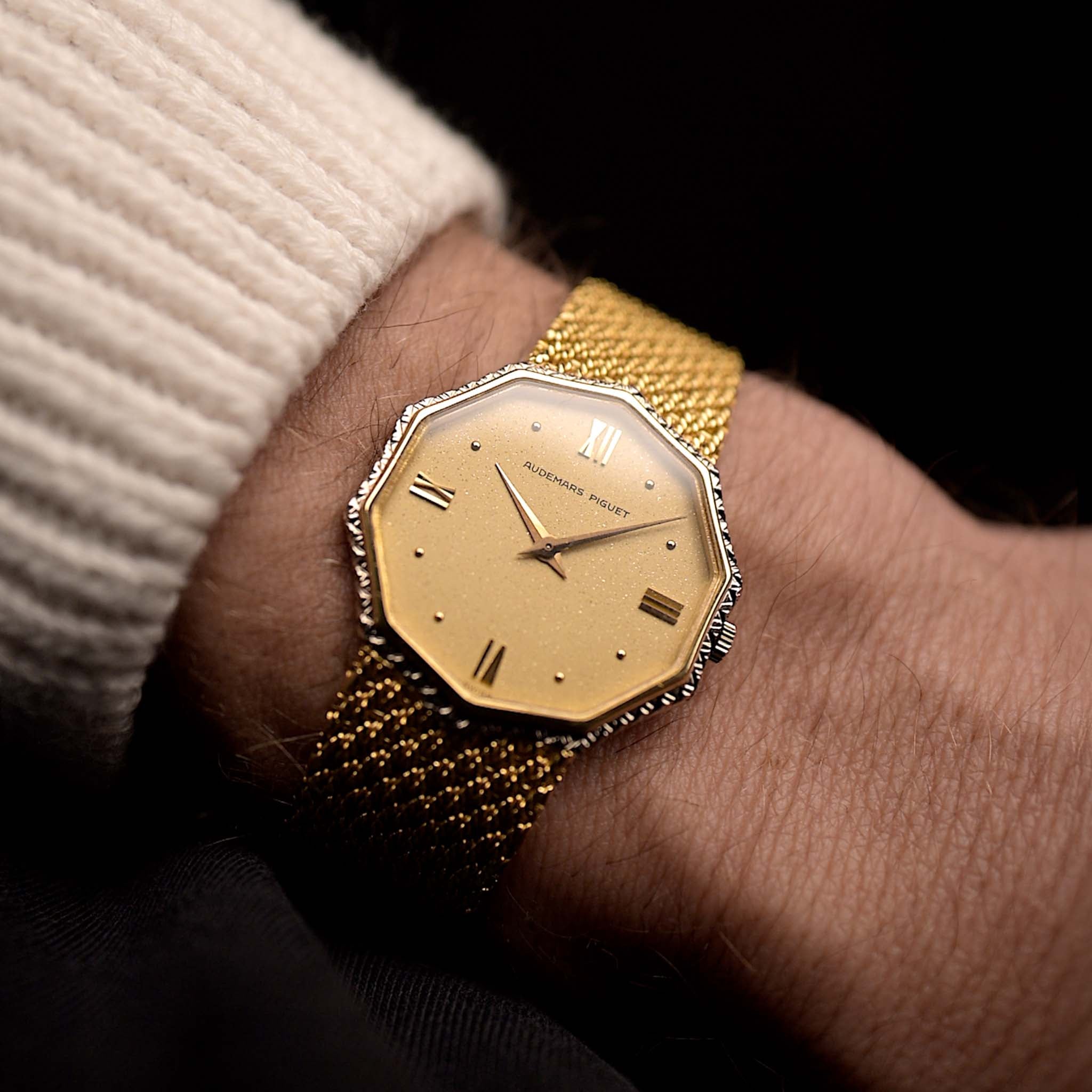
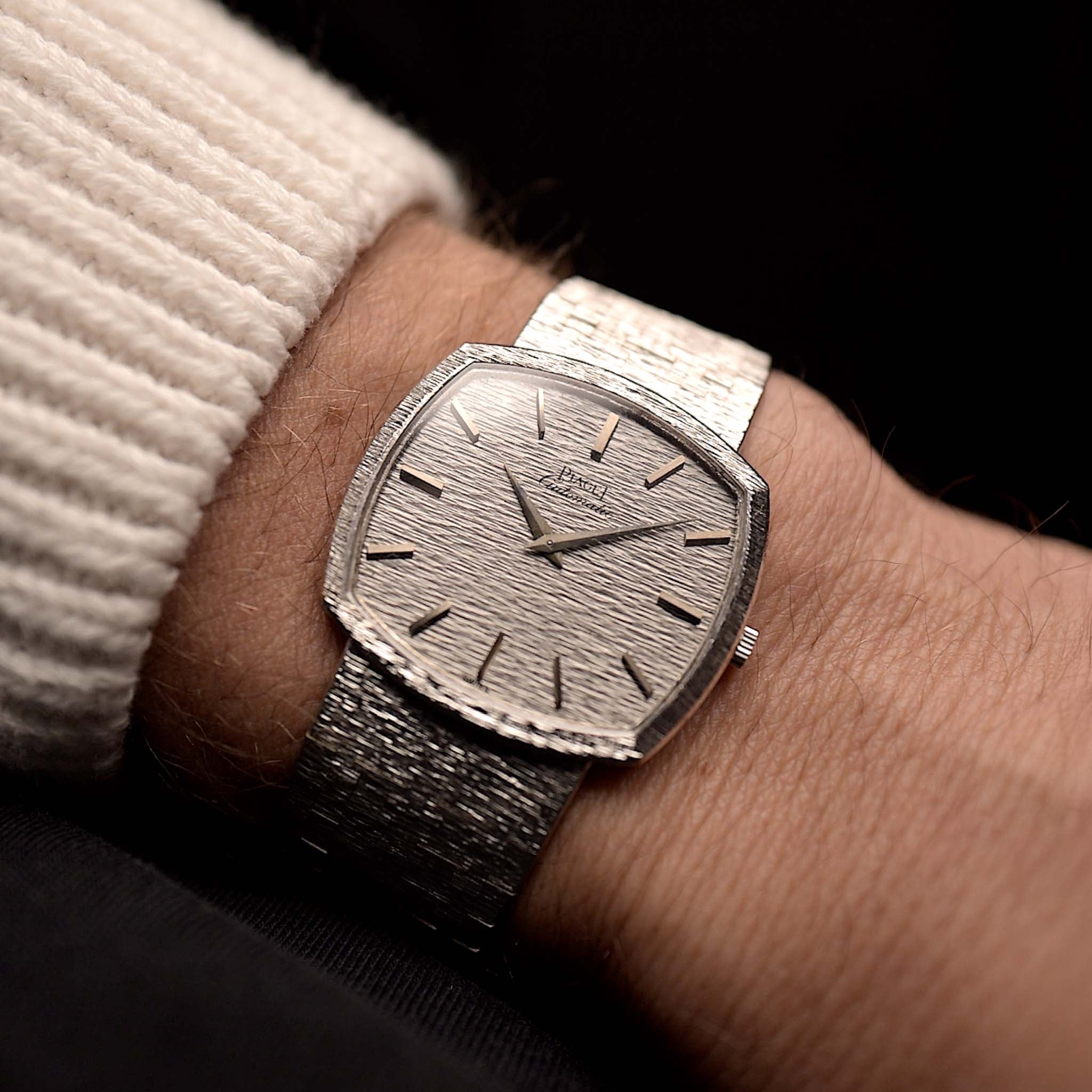
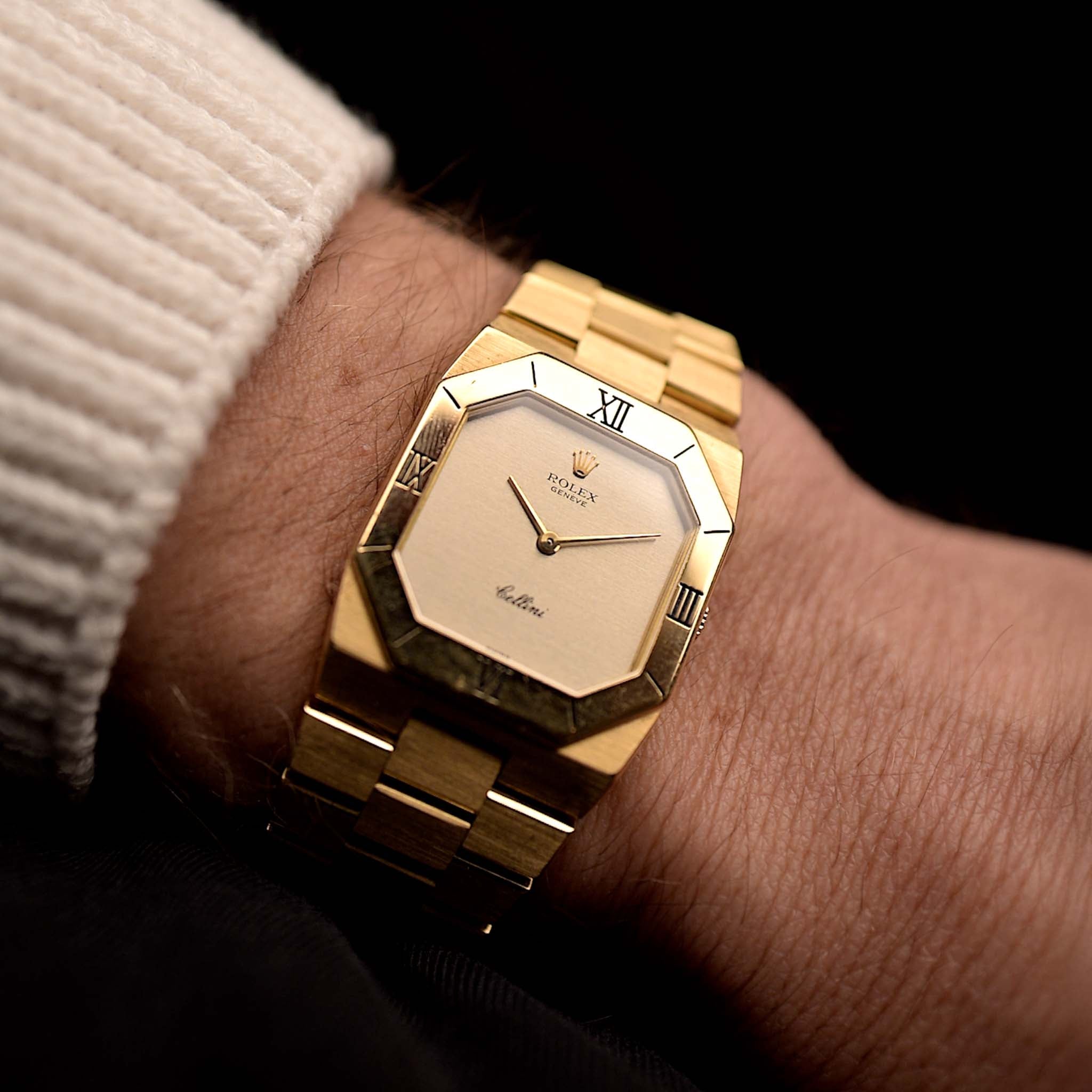
Here we are, one underestimated virtue of watch design is how to case both the dial and the movement in a practical, fitting and literal frame. It is engineering masterwork and should be driven by purpose and not just tradition. That also means that the perfect case - for a chronograph or any type of watch - is not necessarily round. And there are many examples. Several memorable chronographs have followed the path of non-circularity and featured more extravagant case shapes. The Heuer Monaco, Zenith El Primero, Omega Speedmaster Mark II, as well as the Heuer Autavia 1163 all have in common that they are - in a good way - out of shape.
Now the interesting question is whether the overall design language of the classic chronograph epochs translates into the execution of their watchcases? The experienced watch nerd might already guess the answer from the iconic examples above but let's have a closer look at the data.
 Figure 3. Different case shapes for 1950 and 1970 chronographs. Early chronographs clearly indicate a puristic design with round cases whereas around 1970 the watchcase is a far more active part of the watch design.
Two epochs in complete antithesis: Around 1950 the chronographs exterior is almost calm and soothing. It slips into the background to let the dial speak. Round case with a smooth bezel … the peak of understatement. And yes that is exactly what you would expect from the age of dress watches. Remember, the chronograph of the time is the dress watches more complicated brother, a highly sophisticated and almost ornamental item. Nothing needs to be oversaturated and if anything is to stand out, it seems to be the puristic simplicity of the design. So from a case-design standpoint a rather boring epoch.
On the complete other end of the spectrum we got the 1960s and 70s. It’s the time of breaking with old conventions and reinventing the watch as a whole. In no other period – speaking for all watches types – non-circular cases are as common as in this space age era. Of course the round cases with a smooth bezel are still very common, it is a blueprint that always works and is less frequently questioned than any other detail on a watch.
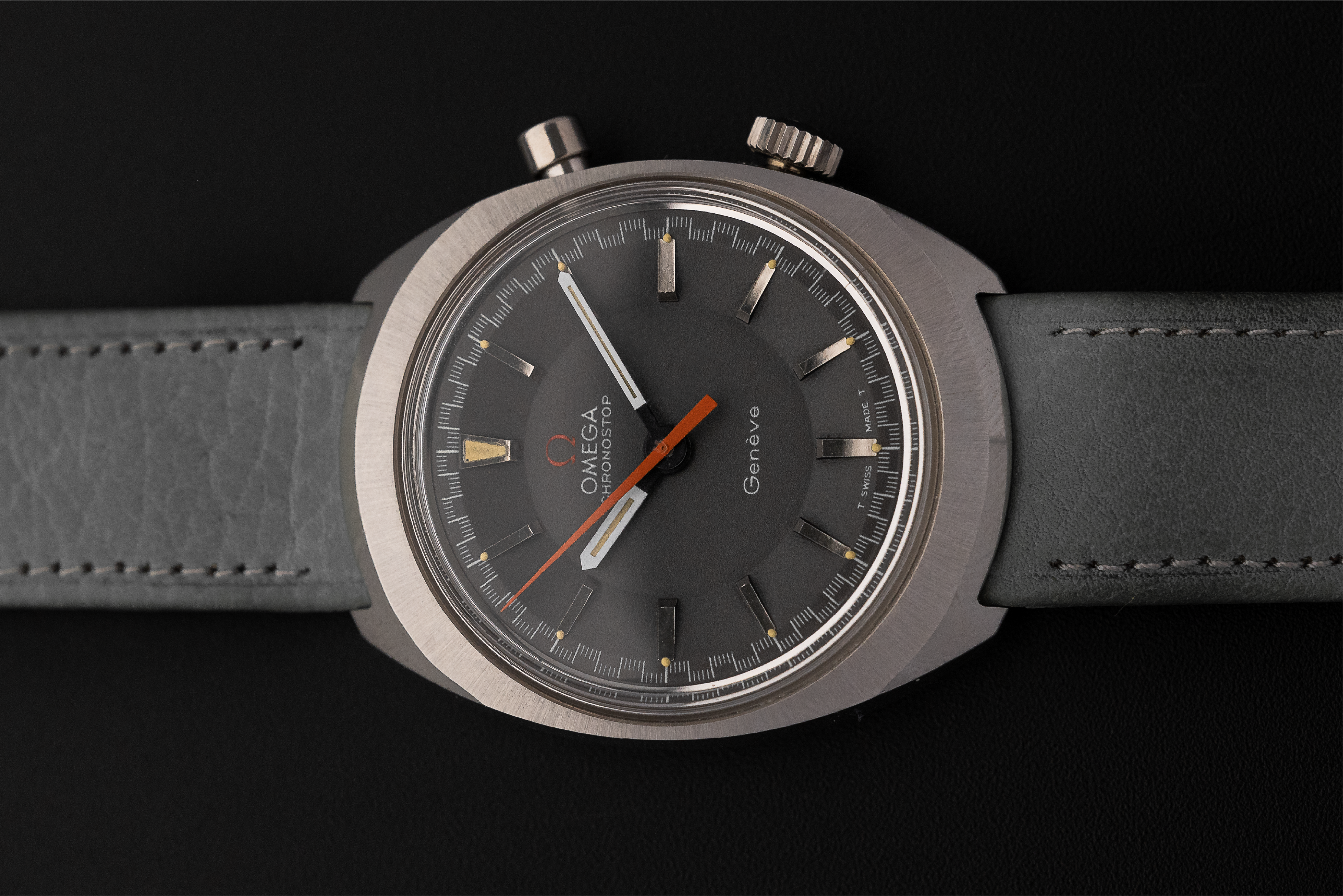
But around 1970 the metallic outline is as much an active part of the design process as is the interior and the mechanical movement. For chronograph watches particularly the slightly elongated C-shape with integrated lugs was extraordinary hip. It gives the watch a very aerodynamic yet sturdy appearance, the shape of a bullet. Just the perfect design for a sportive and aeronautically enthusiastic time period[2-9]. Almost a logical best case scenario as it already looks like it has been directly cut out of an airplane wing. And yes, it is not exactly the most common option of the time, yet the non-circular case-shape still best defines the 1970 chronograph. Not surprisingly most non-circular cases were from this era and the C-shape is very much its poster boy format.
 A golden 1940s Tissot Chronograph. A stunningly looking watch? Absolutely! A revolutionary case design? Not so much... Photo @goldammer.me
We have seen quite some changes in the general approach towards chronograph design between 1950 and 1970 but potentially the case shapes are the most drastic. One the one hand we got the early chronographs with understated and simplistic case design; a body that is supposed to blend in and support the dial.
On the other end we got an epoch that celebrates the case as an important asset in itself. A possible reason can be how the case design has been perceived. Was it an element for visual pleasure or rather an active part of the multimodal wrist experience? I’d argue that with the increasing demand for tool-watches the focus has shifted towards the latter.
The caressing grip from the case is a vital part of the of the overall wrist presence. And around 1970 we got an epoch that celebrates the case as an integral part of the watch design, the peak of non-circularity. That said maybe the 1950 are the visually- and the 1970 the more haptically pleasing chronograph experience? Maybe that's indeed an over-arching theme but we don’t know for sure yet as we have to take a closer look at the dial first...
The Golden Age of the Chronograph
Part I - History
Part II - Elegance & Utility
Part III - Case Design
Part IV - The Dial
Part V - The Essence
References
[1] Watches from Chrono24, extracted 2020 Nov. 29th; Karlsruhe, Germany;
[2] Chronomania: The 50-Year History of the Automatic Chronograph, WatchTime;
https://www.watchtime.com/featured/chronomania-the-50-year-history-of-the-automatic-chronograph/
[3] A Noteworthy Watch – Breitling’s “Scott Carpenter” Cosmonaute; Jeff Stein, OnTheDash;
http://www.onthedash.com/noteworthy-breitling-cosmonaute-scott-carpenter/
[4] 5 Watch Brands Involved in Space Exploration: Breitling, Fortis, Bell & Ross, Tag Heuer, Zenith; Roberta Naas, A Timely Perspective;
[5] The Omega Speedmaster history; Alessandro Mazzardo, Time And Watches;
https://www.timeandwatches.com/p/history-of-omega-speedmaster.html
[6] Alles über die Omega Speedmaster im Überblick; Redaktion, WatchTime;
https://www.watchtime.net/uhren-klassiker/alles-ueber-die-omega-speedmaster-im-ueberblick/
[7] How Omega’s Speedmaster ‘Moonwatch’ made space history; Rebecca Doulton, The Jewellery Editor;
http://www.thejewelleryeditor.com/watches/article/omega-speedmaster-moonwatch-history/
[8] The “Colonel Pogue” Seiko 6139; James Lamdin, DreamChrono Blog;
https://www.dreamchrono.com/2013/11/seiko-6139-pogue/
[9] Sinn in Space: the 140/142 Chronographs; James Lamdin, Worn&Wound;
https://wornandwound.com/sinn-in-space-the-140142-chronographs/
All rights on text and graphics reserved to the Author.