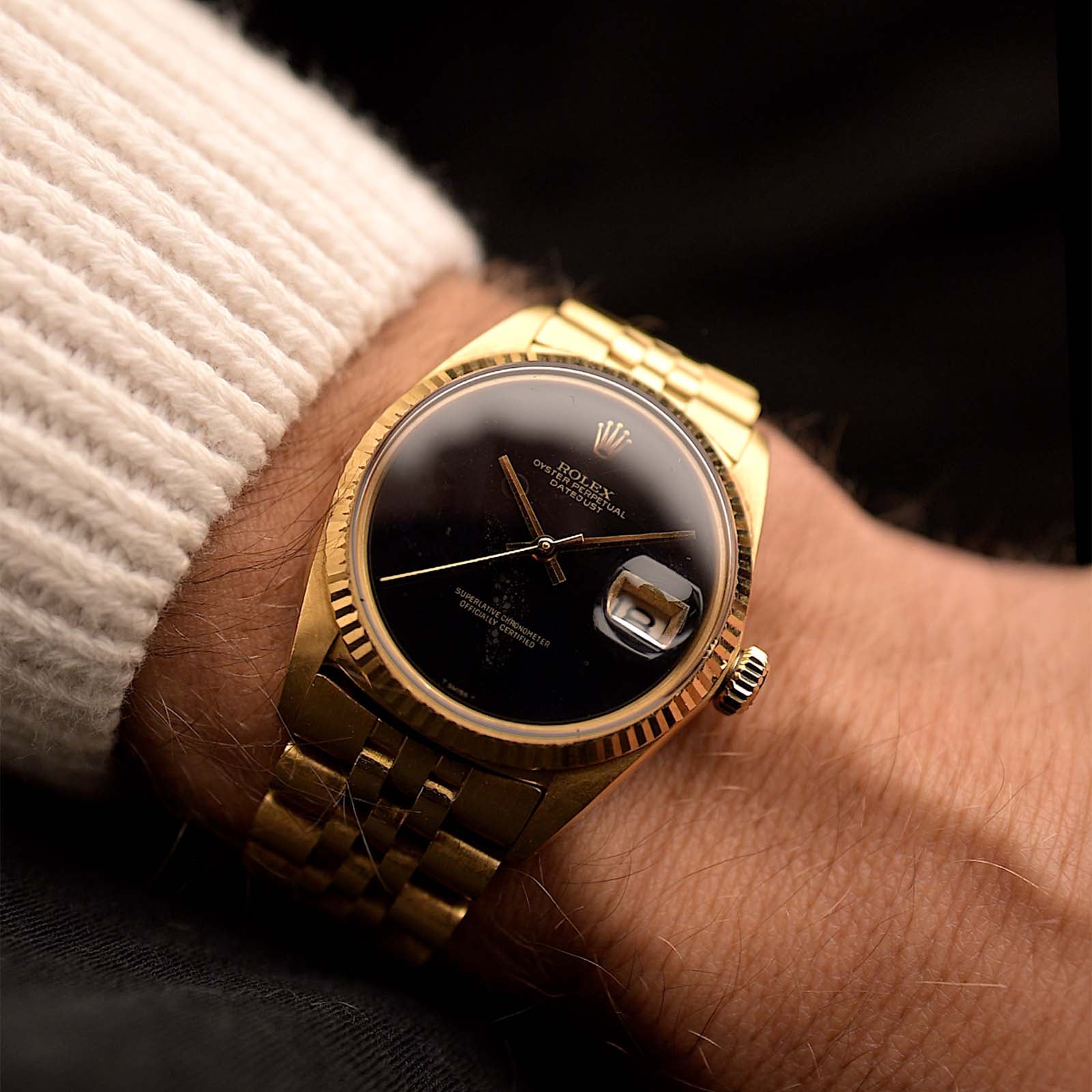
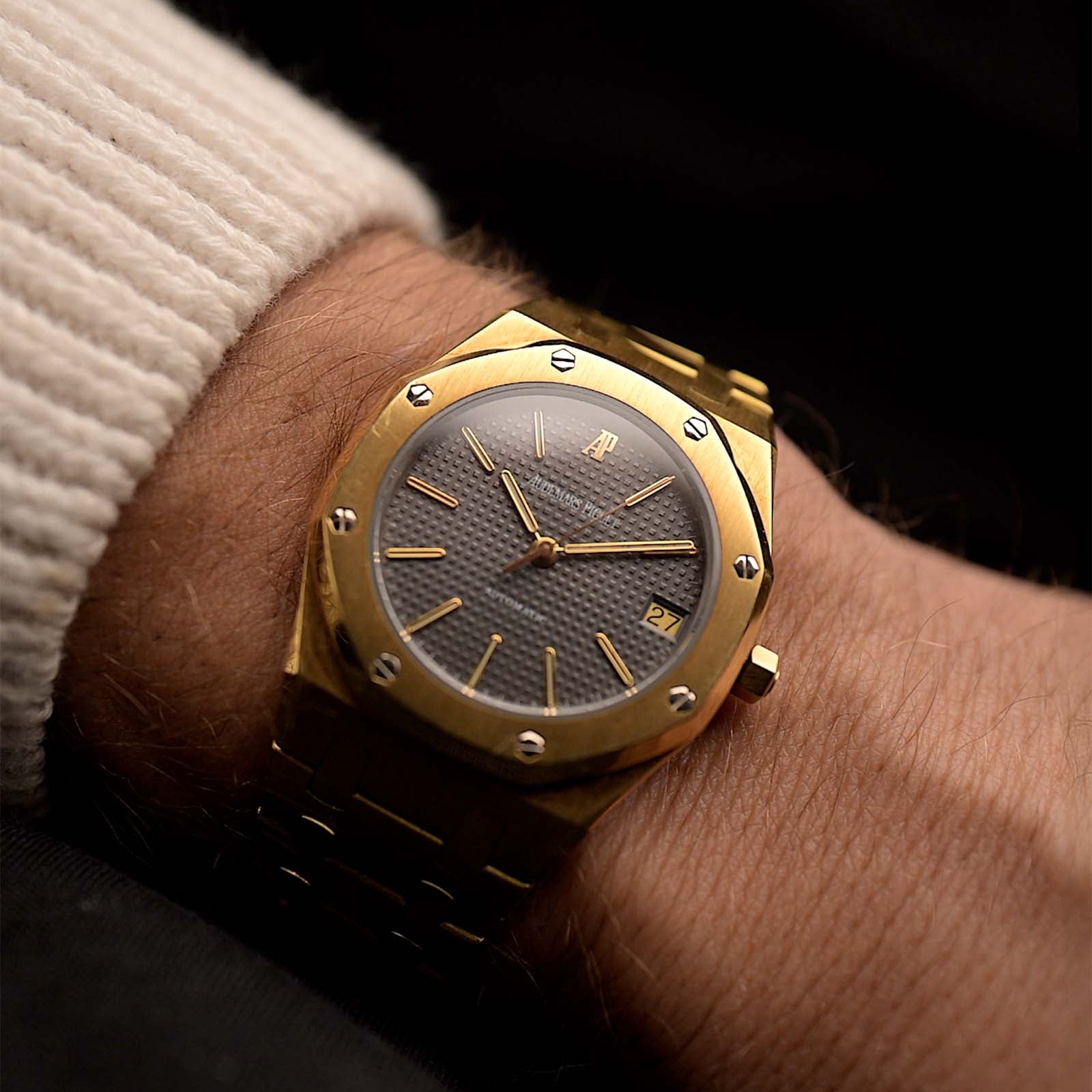
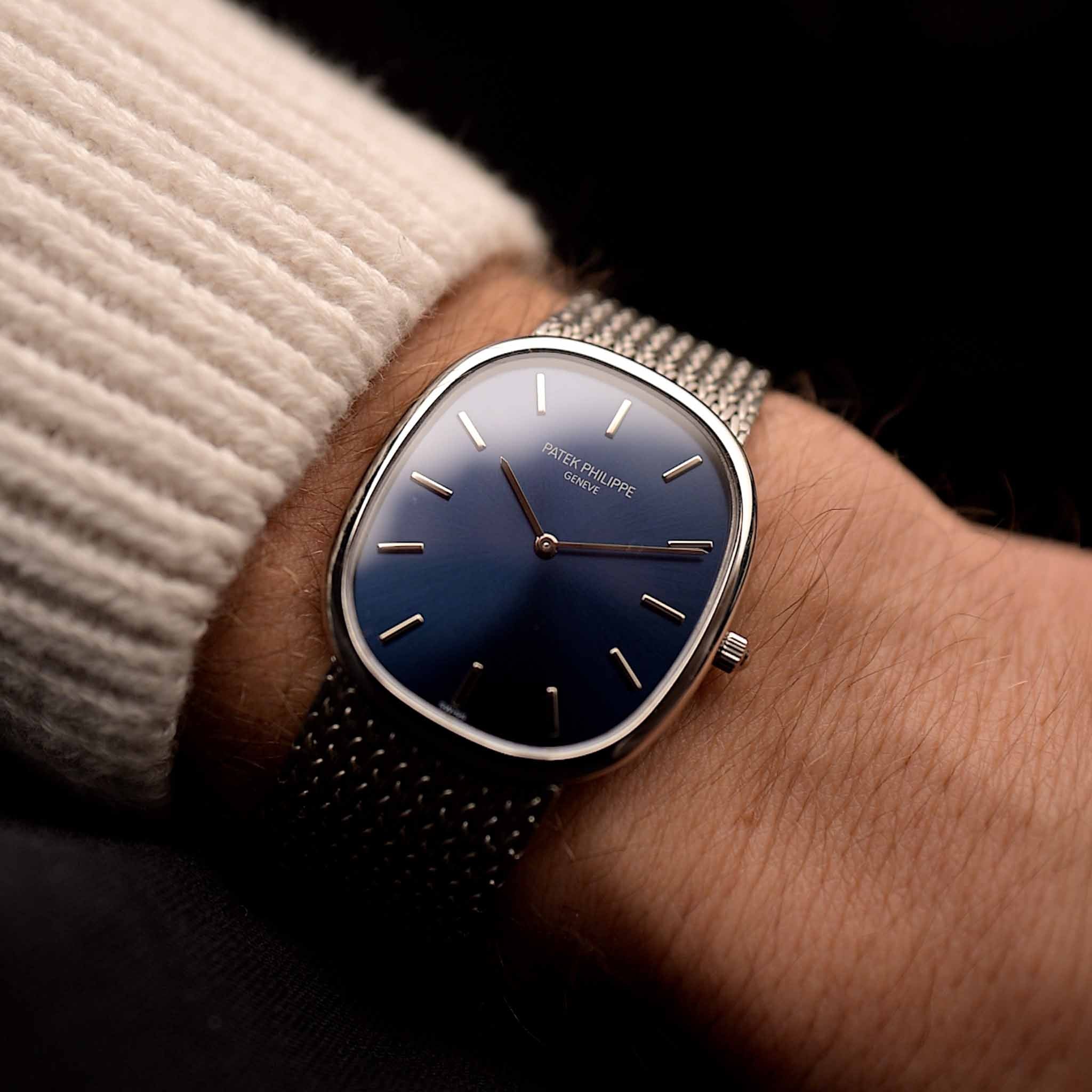
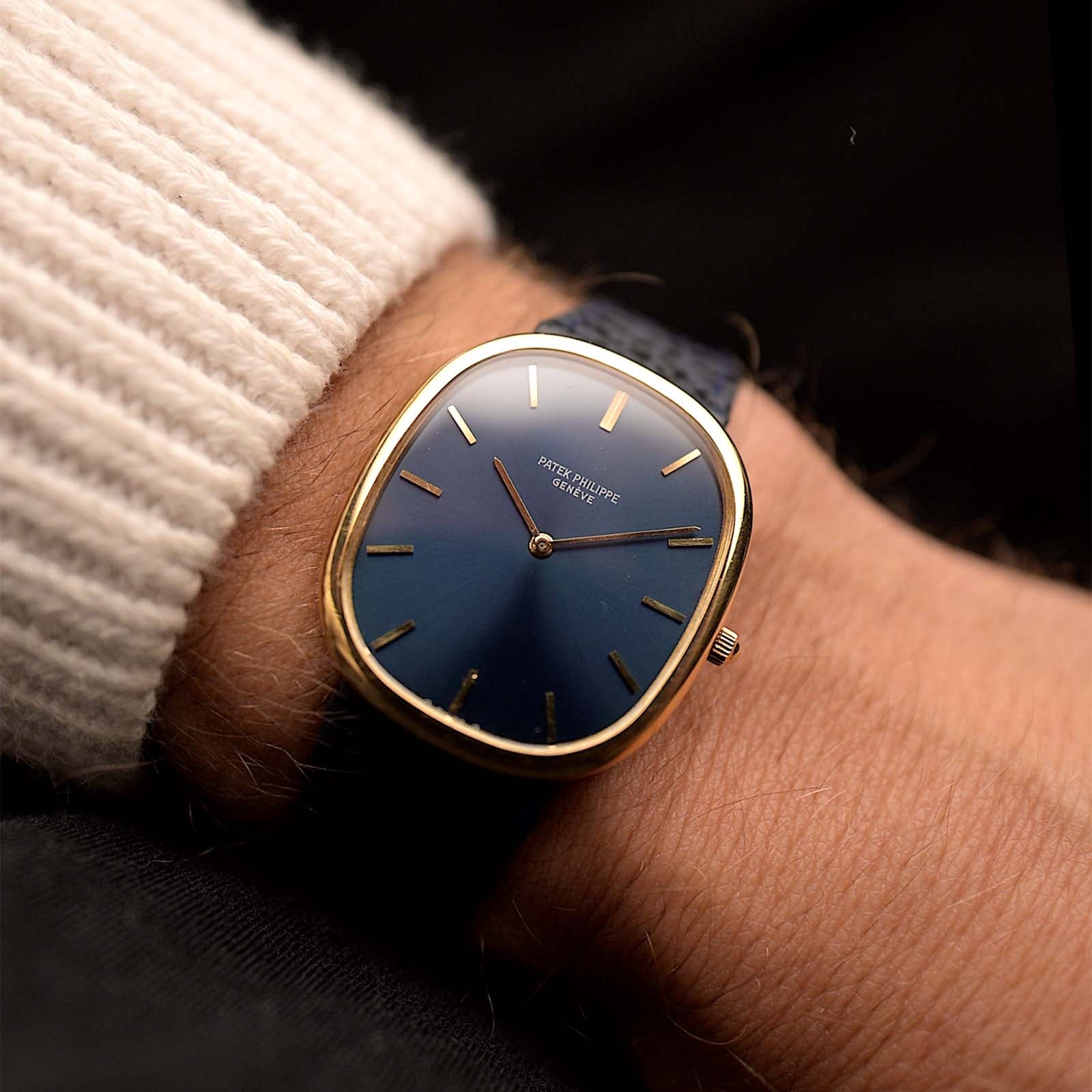
This is the fourth part of our series and so far we have seen two epochs contrasting each other perfectly. But the potentially most distinguishing features are still missing and in the fashion of a classic close-up shot we are finally seeing the hero's face. Watches with the chronograph complication have several unique dial features... This time we will first get closer to the time-telling design elements, the basic contours that define the character of every watch.
November 02, 2021
Golden Age of the Chronograph - The Dial
 Marcus Siems @siemswatches
Collector, Author, Data Analyst
This is the fourth part of our series and so far we have seen two epochs contrasting each other perfectly, two ends of the spectrum that we call the chronograph. We got the mid-century elegant haute horology accessory on the one and the sturdy racing tool on the other end. But the potentially most distinguishing features are still missing and in the fashion of a classic close-up shot we are finally seeing the hero's face.
Watches with the chronograph complication have a lot of distinguishing dial features... sub-dials, diverse scales, countless small hands. But we will come to those in the next week. Today we will first get closer to the time-telling design elements, the basic contours that define the character of every watch. Elements that are mainly subject to the individual brands, the designers and the public demand. Of course I'm speaking about the watch hands and the hour markers.
 This 1940s Doxa Chronograph beautifully sports multiple Tachymeter scales, overlaid on two integrated sub-dials, an outer Telemeter ... oh wait, those are next weeks topic. Photo @goldammer.me
Which hands to circle around your pinion and which markers to frame your dial are choices primarily driven by the creative minds of the people envisioning the final watch experience. To find out what these dreams were made of I assessed the dials of over 4000 watches, including about 800 chronographs - publicly listed on chrono24[1]. With quantitative data analysis we can then draw an evidence-based picture of the time all these watches were born into.
 Figure 4. Hand shape and marker style of the 1950 and 1970 chronograph. Quite the opposite to the case shapes we see a lot more diversity in the early chronograph design language. Around 1970 chronograph watches feature only either index or stripe hands and stick or baton hour marker. Contrary, for the 1950 chronograph the three most common hand designs do not even make up 60% of all pieces, synonymous with high variability.
Antithesis through and through but this time the variability comes with age. Starting with the 1950 chronograph we see that it is giving us every style the time got. The dial is a cornucopia of different hand and marker combinations. And those are different design schools as well; one dial might showcase the curvy and naturalistic shapes of the late Art Noveau when the next displays the geometric simplicity of the Artdeco. This transition of styles plays beautifully on these classic chronograph pieces.
As diverse as these styles are they are still perfectly impersonating mid 20th century watchmaking: Leaf, dauphine and syringe hands are all never again as popular in the vintage mass market as before 1960. The same holds true for the hour markers – numerals and dagger – as they clearly reflect the most popular choices of the 40s and 50s, respectively. And these diverse yet distinctive optics reflect the glamour we very much appreciate, even look out for, when committing to a vintage watch or a modern heritage watch, too.
 A Universal Geneve Tri-Compax - by design a quite representative piece of its time yet by far not giving away everything the 1940s/50s got - the time of dial diversity. Photo @goldammer.me
On the other hand we got the 1970 chronograph. As the 1960s/70s have spearheaded creative metallic outlines their general dial design is best described as versatile. Two different hands types – index and stripe – and two marker styles – stick and baton – each make up the four possible combinations of the age. Not as funky as one might have thought.
But maybe clear lines on the dial is exactly what the people wanted in 1970. Potentially, what we experience as unusual, sometimes flashy, case design might be engineered for the complete opposite, brutal dedication to functionality and ergonomics! And this dial pattern shows this honest sense for practicality.
Remember, the chronographs of 1970 were largely envisioned for sporting, flying and diving. Index and stripe hands are basic shapes that can handily feature large amounts of luminous material and reflect light - visible in night and day. And the same holds true for baton hour markers. Combine it with the black dial color and you got yourself a watch face that is perfectly legible in any condition. It’s not funky, it’s the new approach to utility, a classic tool-watch.
 Maybe we got the 1960s/70s all wrong - Maybe it's not about the looks, maybe it's all about functionality... Photo @goldammer.me
Overall, the 1960s and 70s seem to not be as flamboyant as one might have thought initially. It might actually be the Zeitgeist approach to blunt functionality. And functionality clearly contrasts with most most of 1940s/50s chronographs. Their purpose is the look and as such they prevail tremendously. Who could resist the 1950 charme? Well possibly someone looking for the sturdy metal chronograph of just 20 years later. However, let's get down to what makes a chronograph look like a chronograph - it's time to check out all the timing functions: The chronograph specialties.
The Golden Age of the Chronograph
Part I - History
Part II - Elegance & Utility
Part III - Case Design
Part IV - The Dial
Part V - The Essence
References
[1] Watches from Chrono24, extracted 2020 Nov. 29th; Karlsruhe, Germany;
All rights on text and graphics reserved to the Author.


Leave a comment