

Real design is never random! That too is true for a watches dial color. As minuscule as this design element might appear it can grant us new insights into the history of watchmaking if only we allow ourselves to look closer. I always love to challenge myself - and the reader - to look beyond the classic narratives of the watch world. So, please, allow yourself to follow me down the rabbit hole of historic watch design in all its facets and ... colors.
September 27, 2022
The Ultimate Watch Guide - Dial Color

Marcus Siems @siemswatches
Collector, Author, Data Analyst
A Story Everywhere Who would have guessed that there might be an interesting story to dial colors? I always love to challenge myself - and the reader - to look beyond the classic narratives of the watch world. I think the most minuscule details can grant new insights into the history of watchmaking if only we allow ourselves to look closer. So, please, allow yourself to follow me down the rabbit hole of historic watch design in all its facets and ... colors.
True design is never random! Behind every detail there's a plan and a bigger picture. A vision that floats from someone's mind to a drawing board and ultimately to our wrists. No element, as minor as it may appear, is simply there.
The very same applies to the dial color of a watch. It too is subject to several factors ranging from contemporary trends to utility and finishing techniques. To better understand what colors can tell us about the watch world throughout the last Century we quantitatively assessed the distribution of dial colors[1].
 Gold doesn't necessarily have to be flashy. In many cases it perfectly blends into the overall design, easing the contrast. There's so much color can tell us about a design. Photo @goldammer.me
1) White Dials
 Figure 1. Historical distribution of white dial popularity from 1940 to 2000, highlighting dress watches (green dashed line).
So we start with the most gleaming yet also most understated color. It is also bestows the cleanest look to any dial. Not surprisingly we see that over half of all dress watches (53%) and over 30% of all chronographs and dress casual pieces come in white.
 A 1940s Artdeco classic - an Omega dress watch with white sector dial. Photo @goldammer.me
It is also the color of the 1950s. Peaking in 1952 white dials are by far the most popular choice of the decade. Highlighting the admiration of dress watches during those years in general. However, looking into the relative numbers within the dress watch category we still see that the 1950s favor this color (over 60% dress watches) over let's say the 1970s (below 30% dress watches). Quite surprisingly though - or maybe not for everyone - white is THE dress watch color of the 1990s Neo-Vintage era (over 70% dress watches).
2) Silver Dials
 Figure 2. Historical distribution of silver dial popularity from 1940 to 2000, highlighting dress casual watches (green dashed line).
If white is the color of the 1950s and 1990s, silver dials fall right in the middle. During the 1960s and 70s the silver dial was the chic and clean alternative to plain white. Given that we went through the space age era silver this not an odd choice. On top, we'd also see that the style during that era generally was a lot more casual: the distribution of silver dials clearly follows that of the dress casual watches.
 Definitely a space age classic: this 1970s Universal Geneve Polerouter Date with angled lugs and silver dial. Photo @goldammer.me
3) Blue Dials
 Figure 3. Historical distribution of blue dial popularity from 1940 to 2000, highlighting dive watches (green dashed line).
Say what you want but blue is a modern color. It virtually didn't exist in the watch landscape prior to 1960 and wasn't really used until Patek Philippe introduced their Ellipse (see photo) and gave this color a royal touch to it. Yet, it's mainly a color for utility oriented watches like dive watches (10%), dress casual watches (9%) and sports watches (7%).
 The epitome of dress casual - a 1990s Rolex Airking, not surprisingly with a stunning blue that ruined almost turquoise with time. Photo @goldammer.me
So this color made quite the transition from the ultimate elegant to the forefront of tool watches. This is further underlined by usage in dive watches. Blue in general peaks in the late 1970s, but that peak comes from dress casual watches. Later, we actually see that dive watches are the major source for blue dials. A color that has been re-imagined at least three times over the last 60 years.
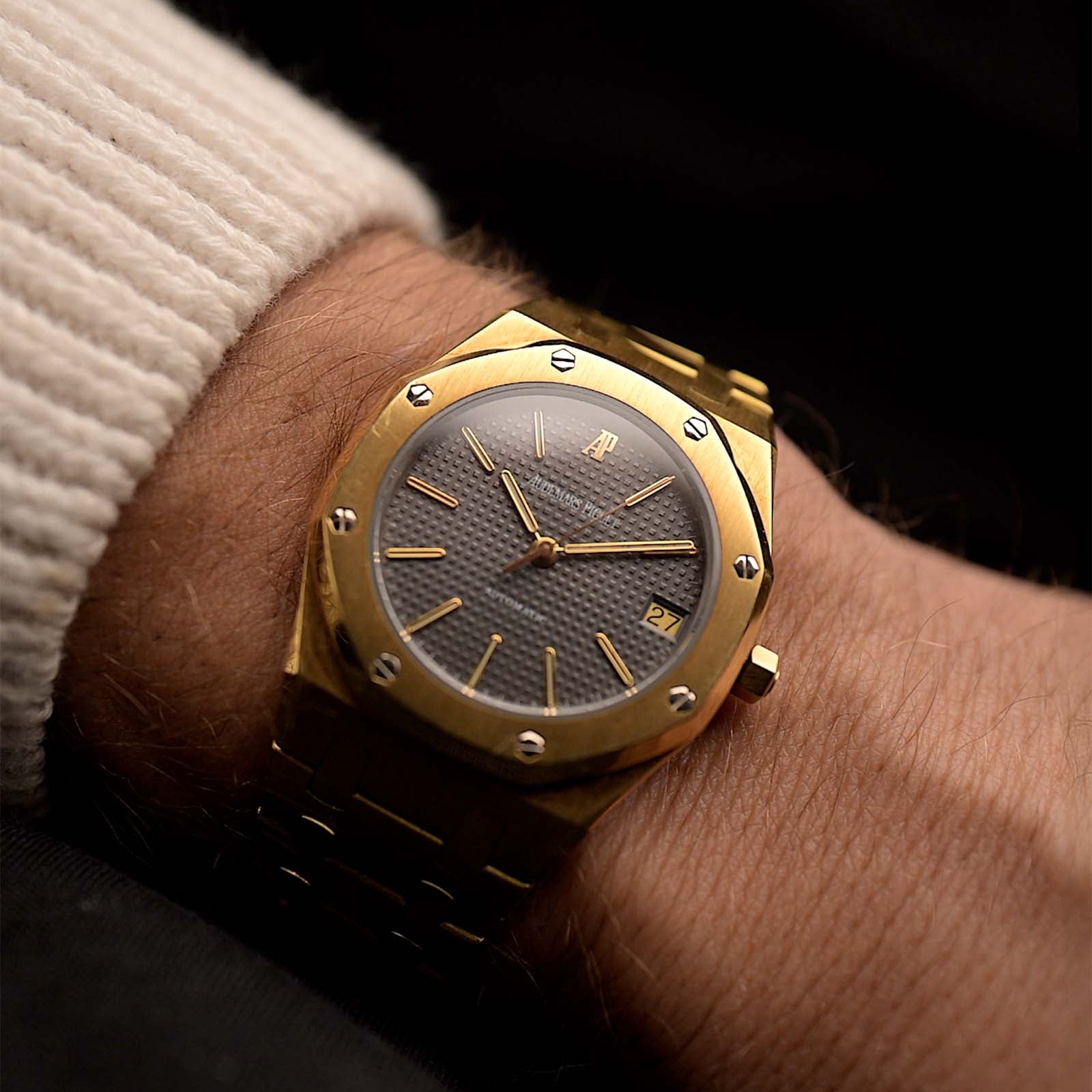
4) Golden Dials
 Figure 4. Historical distribution of golden dial popularity from 1940 to 2000, highlighting dress watches (green dashed line).
Golden dials might be a little flashy for some but to others it's the ultimate elegance. And you have to admit: A golden dial on a golden watch blends right in and adds a lot of subtly to the overall design. Consequently, you can see this color mainly on dress casual (18%), dress (16%) and chronograph (6%) pieces.
 A golden dial doesn't always have to be loud. Photo @goldammer.me
If we take a closer look at the historical distribution of golden dials one thing that is evident is that this color does not have one particular peak in history nor does it plateau at some point. It rather waxes and wanes through the 20th Century. But if you look closer these peaks start to make a lot of sense.
Looking at dress watches with golden for example (green dashed line) we can clearly see that one of the peaks (around 1980) can be clearly associated with that watch type. In the early 1980s dress watches apparently had to have the little extra bling. In numbers that means that over 50% of those dress watches came with golden dials. What a monopole to own.
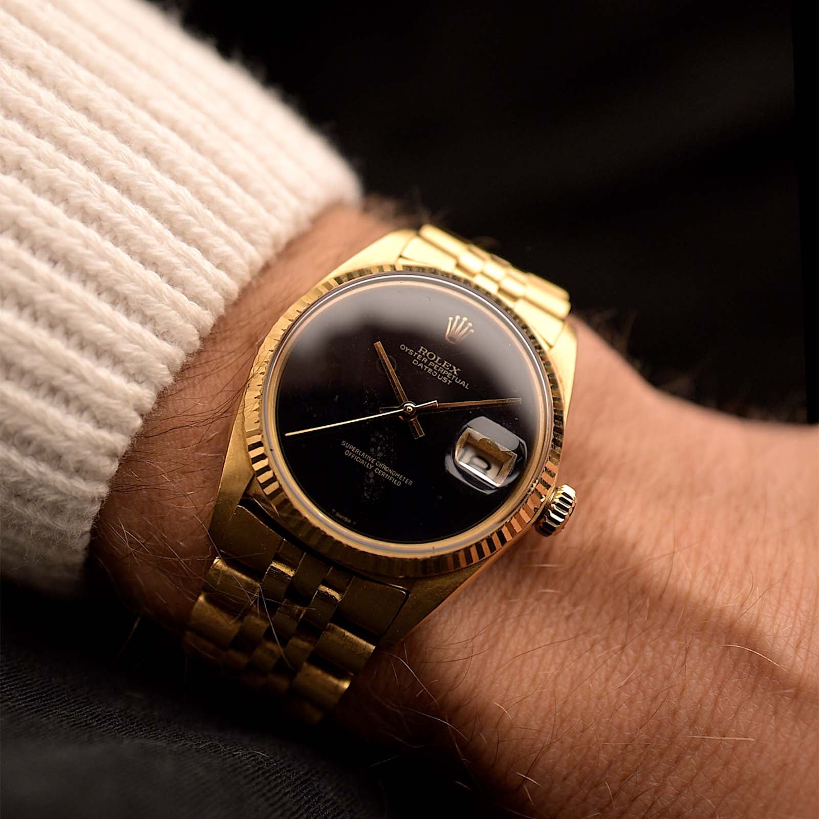
5) Black Dials
 Figure 5. Historical distribution of black dial popularity from 1940 to 2000, highlighting dive watches (green dashed line).
From all the different colors discussed in the article black is the most common one. Black dials have a market share of ~40% from the mid 1960s onwards. There's simply that little post-war dip during the 1950s that black dials are hard to come by.
But it's not only the classic and timeless elegance that made black the "ultimate" dial color. It's the utility color. If you want a watch with a certain function, legibility becomes a major factor - and black simply can give you that in any condition. Underwater, in the night, camouflaged in trenches, you name it. Thus, over 90% of all military watches, 87% of all dive watches, about 60% of all sports watches and a good 40% of all chronographs feature black dials.
 And the stars fell out of the sky / And the tears rolled into the ocean / And now I'm looking for a reason why / You even set my world into motion / Black and Gold... Photo @goldammer.me
You see, as utilitarian as this color is, it again can nicely show us transitions in design languages. Looking at dive watches, probably the ultimate tool watch, we see that early executions almost exclusively came with black dials. Well because those were still mainly used for actual diving. Over time these pieces became more of a fashion statement and it wasn't necessary to have ultra-large lump plots against a black dial and so other colors became more prevalent.
The Conclusion
As you can see - and I've hopefully shown you - dial colors are all but random. Through history we can observe several shifts in design archetypes simply by looking at the dial color.
- 1) we can see that colors can display the contemporary taste of certain watch types. For dress watches for example we see white as the color of the 1950s and the Neo-Vintage era but golden are the late 1970s and early 1980s.
- 2) Colors can be completely associated with certain watch types and thus follow their popularity. A perfect example are silver dials, which are tightly linked to dress casual pieces.
 So much depth in a black dial... Photo @goldammer.me
- 3) Colors can indicate shifts in the image of an archetype. This you can for example observe with the dive watch. It shifted from the tool-esque black to more fashionable (dark) colored dials over time but predominantly in the 1980s.
- 4) Even though a color might appear to plateau in popularity it doesn't mean it doesn't change its ratio between watch types. You can see this quite neatly with blue dials. Those are tightly linked to dress casual pieces in the 1970s but become more poplar with dive watches in the 1990s. Yet from the historical distribution this is not evident.
And you thought color is just a minor detail?
References
[1] ~50,000 Watches from Chrono24, extracted 2020 Nov. 29th and Jan. 6th 2022; Karlsruhe, Germany;
All rights on text and graphics reserved to the Author.


1 comment
Hello Marcus, thanks a lot for the analysis. It seems my tastes are … mainstream! Just for clarity: where do you set the dividing line between “dress casual” and “sport”? If, say, a Date Just or Aqua Terra or PRX are dress casual, what would constitute a “sports” watch outside of the categories chrono, field, diver? Thanks a lot.
Leave a comment