
I think we - as did history - have established the Royal Oak as a trendsetting, revolutionary timepiece. But beyond the radically new concepts there had to be some aspects that resonated with what has been common in the early 1970s. In the end, Gerald Genta was a veteran designer at that point with 15+ years in the industry. A long time in which you typically develop a preference for certain details. For the Royal Oak these preferences might show in the two index hands and the stick hour markers.
December 07, 2021
A Creative Dial - How The Royal Oak Tells Time
 Marcus Siems @siemswatches
Collector, Author, Data Analyst
I think we - as did history - have established the Royal Oak as a trendsetting, revolutionary timepiece. But beyond the radically new concepts there had to be some aspects that resonated with what has been common in the early 1970s. In the end, Gerald Genta was a veteran designer at that point with 15+ years in the industry[1,2]. A long time in which you typically develop a preference for certain details.
For the Royal Oak these preferences might show in the two index hands and the stick hour markers. Not only were thy the most classic designs of the last century, on top Genta seem to have been particularly fond of the stick hour markers with his pieces. A very simplistic yet fundamental design element often applied directly to the dial and usually just a line, a flat cuboid.
 Gerald Gentas approach to turn a common feature into something extraordinary - the pie-pan dial makes every marker become a highlight. Photo @goldammer.me
However, Genta used this style but always with a wink, a little extra. See for example the his first major project, the Universal Geneve Polerouter/Polarouter: stick-like marker embedded in a fluted ring around the dial. It rather resembles Rolex's engine turned bezel than any sort of off-the-shelf hour markers. Similarly the Pie-Pan structure of the late 1959 Omega Constellation adds another layer to the way this time-telling reference frame is applied. The recessed outer rim of the dial adds depth and extents ones focus all the way to the edge.
 Figure 3. Distribution of hour markers around 1972 and of stick marker from 1940 to 2000. In 1972 the stick marker is by far the most popular style but as with the index hand it shows that the hype is over in the 70s. Data from Chrono24[3].
However, as classic and stylish as these designs are, popularity-wise they are on a downward trajectory. Both have already eclipsed the peak of their popularity and many watch manufacturers are moving on to other variations. The index hand shows just the same trajectory only shifted forward by a few years.
The index hand was hyped during the decade prior to the Royal Oak, the 1960s. It was the new simplicity - form follows function - that made the index so favorable. This new, condensed design language made it the perfect successor to the edgy shapes of the 1950s, the Dauphine and the alpha hands. The 1970s on the other hand stand for a more playful, more colorful and legibility oriented style - as for example with the broad stripe hand.
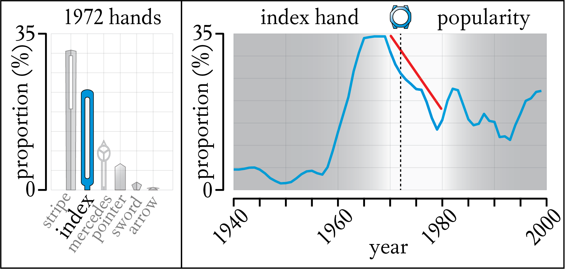 Figure 4. Distribution of hand designs around 1972 and of index hands from 1940 to 2000. In 1972 the index hand is still one of the most common hand styles but already shows a clear downward trajectory in popularity all throughout the 1970s.
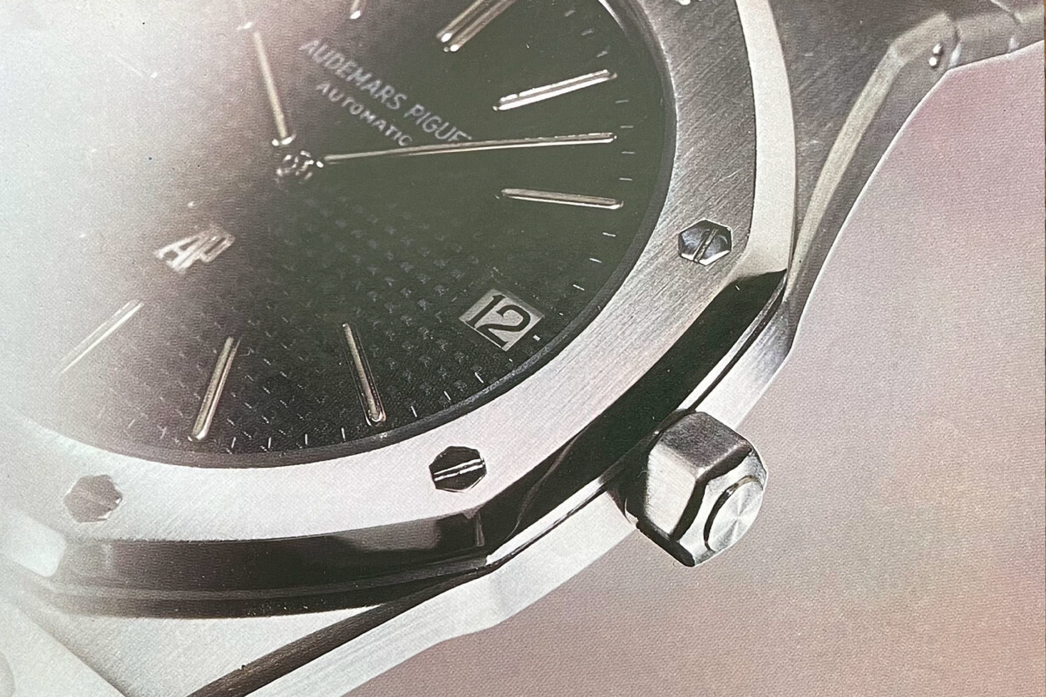
Then why did Genta choose such - superficially - antiquated designs for his masterpiece? The devil is again in the detail. Yes, the Royal Oak 5402 features index hands and stick hour markers but the execution of those is very different to the prototypes of the time. Those were typically featuring sharp edges and particularly the stick hour markers were mainly applied to stay in the background.
On the 5402 both hands and markers were in tune, one referring to the other. The same layout, the same structure, the same purpose uniting these two elements. Combined in style both hands and markers do not follow the classic conventions. There are no edges they are elliptical in shape and lightened up by their white interior. If you zoom in you clearly can see that both these elements are simply two words from the same design language.
 Vintage watch advertisement from Wempe New York[7] showcasing a bicolored Royal Oak and specifications.
It makes sense to use classic design prototypes, like the hands or the hour marker, and reinvent them for your own purpose. In the end, people wouldn’t follow a revolution if there were not at least one or two things they already know and love. Another thing to keep in mind is that Genta envisioned his Royal Oak from diver’s brass helmets[4,5]. The nautical theme repeats itself in the name - Royal Oak - which has been a historical British warship[4,6].
Now imagine the watch face is your view from inside that vintage helmet. You see the deep blue of the sea, the water is dark and soothing, fading ripples around you - the tapisserie. What you might perceive in front of you does not have clear edges or angles. The sole thing that reminds you that time still exists are… bubbles. The bubbles from your suit leaving behind a diverting trail of light reflections. And this is exactly how I see the hour markers and the hands of the Royal Oak, like ascending bubbles in the calm ocean.
 The blue and black surround you, nothing but quietness under your breath. A calming and soothing theme for an iconic watch. Photo @goldammer.me
The brass helmet is a great metaphor and an intriguing inspiration. What we see through that helmet, the dial, is what we have discussed so far. Which leaves from this peaceful image only the helmet itself to be analyzed. And this helmet is a pivotal part of Gerald Gentas legacy - the Royal Oak 5402’s case design with an integrated bracelet.
All about the Royal Oak 5402 here:
Part I - Taking Roots in Modern Horology
Part II - A Trendsetting Dial
Part III - A Creative Dial
Part IV - The Bolt Case Design
Part V - Design Heritage
References
[1] Meet the Man Behind Nearly Every Iconic Watch Design of the 20th Century; Allen Farmello, Robb Report;
https://robbreport.com/style/watch-collector/gerald-genta-2864111/
[2] Gerald Genta Royal Oak and Nautilus; Franz Rivoira, TheTruthAboutWatches;
https://thetruthaboutwatches.com/2019/12/gerald-genta-royal-oak-and-nautilus/
[3] Watches from Chrono24, extracted 2020 Nov. 29th; Karlsruhe, Germany;
[4] History of the Audemars Piguet Royal Oak; Alessandro Mazzardo, TimeAndWatches;
https://www.timeandwatches.com/p/history-of-audemars-piguet-royal-oak.html
[5] Warum die Royal Oak von Audemars Piguet ein echter Uhren-Klassiker ist; Redaktion, WatchTime;
[6] How the Audemars Piguet Royal Oak Made History; Adam Craniotes, Gear Patrol;
https://www.gearpatrol.com/watches/a79909/audemars-piguet-royal-oak/
[7] Ad Patina - Audemars Piguet; Nick, Ad Patina;
https://www.adpatina.com/audemars-piguet
All rights on text and graphics reserved to the Author.


Leave a comment